


What happened to UI?
Moderators: Balthagor, Legend, Moderators
-
Inzann
- Warrant Officer
- Posts: 32
- Joined: Dec 06 2011
- Human: Yes
What happened to UI?
Honestly I think the UI is horrible compared to SR2020. A lot of icons that really have no place being there and just to much clicking navigating to the place you want to. Also these menus that automatically open when you hover over messages and disappear if you drag your mouse out of the window. Gah its frustrating UI. It doesn't feel well planned at all I must say. I just started playing the game so I can't give any opinions as to whether the core game is any good but so far I'm enjoying it but the UI really needs overhaul for future titles. For me its one of the most important aspects for a game like this.
-
magiclight
- Warrant Officer
- Posts: 26
- Joined: Oct 20 2013
- Human: Yes
Re: What happened to UI?
I kindly disagree, this UI feels similar to that of cold war, but bigger and certainly better. Maybe you didn't like CW's UI either?
2020 was a bit before my time, though, so I can't comment on that.
2020 was a bit before my time, though, so I can't comment on that.
-
Inzann
- Warrant Officer
- Posts: 32
- Joined: Dec 06 2011
- Human: Yes
Re: What happened to UI?
I didn't play cold war since I am not a fan of that period so I can't comment on it. I just feel as they tried to hard making this UI pretty but instead it looks cluttered with small icons and unnecessary graphics, I've gotten more used to it now over time but I still think its a horrible design decision. The game itself seems alright though except for unemployment which I seem to have a lot of issues with. It keeps going down no matter what so I can't expand my industry anymore.
-
Balthagor
- Supreme Ruler
- Posts: 22106
- Joined: Jun 04 2002
- Human: Yes
- Location: BattleGoat Studios

Re: What happened to UI?
If you want the second panel to stay open, simply click on the button instead of mousing over.
I have heard this comment a few times and I always find it strange, as it is essentially the same GUI with some layout changes;
- Department buttons lay in a flat line instead of around the minister pic
- Minister has become a sub-dept.
- Espionage merged into State dept, the rest of Ops currently not part of the game.
- sub-dept buttons are in a vertical line between the dept and sub-dept panels.
- sub-dept panels can be closed completely.
- department and sub-dept panels are taller and narrower
- top bar on screen hugs the left side.
- messages come in on the right side.
If we had made no graphical changes, this is what it would have looked like;
But these changes are really only about location. It's essentially the same GUI. If you look at the sub-dept layout in SR1936, it's even closer to the layout of SR2020 than was SR Cold War.
You do not have the required permissions to view the files attached to this post.
-
Inzann
- Warrant Officer
- Posts: 32
- Joined: Dec 06 2011
- Human: Yes
Re: What happened to UI?
I'd actually prefer that older version. It looks so much more clean and simple to understand.Balthagor wrote:If you want the second panel to stay open, simply click on the button instead of mousing over.
I have heard this comment a few times and I always find it strange, as it is essentially the same GUI with some layout changes;
- Department buttons lay in a flat line instead of around the minister pic
- Minister has become a sub-dept.
- Espionage merged into State dept, the rest of Ops currently not part of the game.
- sub-dept buttons are in a vertical line between the dept and sub-dept panels.
- sub-dept panels can be closed completely.
- department and sub-dept panels are taller and narrower
- top bar on screen hugs the left side.
- messages come in on the right side.
If we had made no graphical changes, this is what it would have looked like;
But these changes are really only about location. It's essentially the same GUI. If you look at the sub-dept layout in SR1936, it's even closer to the layout of SR2020 than was SR Cold War.
I'll just mention a couple of things that bother me about this new UI.
- The size of the UI and the unnecessary space it takes.
- The amount of clicks it takes me to get information about something (was easier in the previous UI)
For example this picture
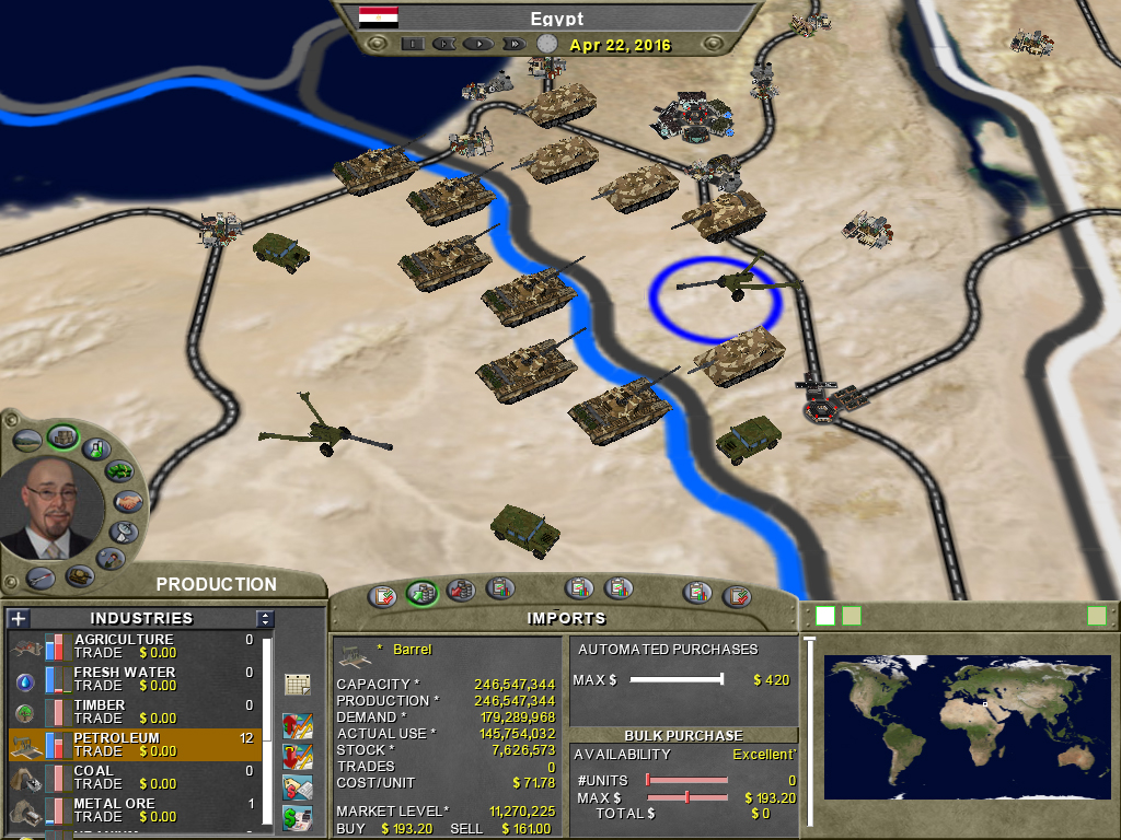
This essentially has the exact same information as 1936 does but its much more readable and no bars etc. Just numbers, which I prefer for a geo-political-simulator.
In this picture
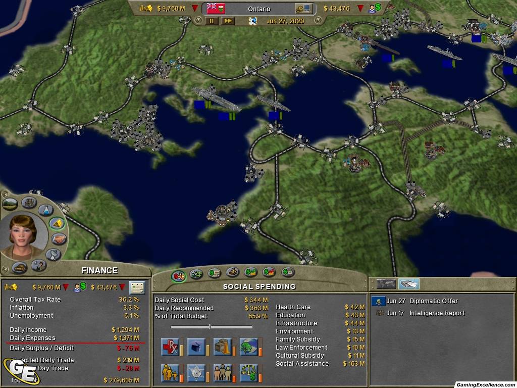
we can see things such as unemployment and inflation without having to hover over an icon like in 1936. However 1936 has a lot of new information if you hover over icons but IMO there should be no need to hover over things to find out information. All country related information should all be visible on the same page. GPD, tax rate, inflation, unemploymet, income/trade, DAR, debt. Of course its fair to have sub-categories for this that go more in-depth as to exactly what is part of the income, what is part of the expenses etc..
In the resource tab, when you hover over a resource you also get information, same thing goes there. This would be much better if this information was readable when the resource was selected.
The defense tabs are okay IMO. Not sure what happened to DEFCON level though? I really liked that feature, it seems to be controlled by the amount of money you spend now?
All in all I think this is a good game series but the UI really bothered me when I tried out 1936, it just doesn't seem very practical at all. Essentially it is the same but the information seems to be buried this time.
-
Kristijonas
- Brigadier Gen.
- Posts: 884
- Joined: Nov 11 2011
- Human: Yes
Re: What happened to UI?
I'm concerned that the new UI takes too much screenspace needlessly, but at the same time I'm happy with bigger buttons.
-
Balthagor
- Supreme Ruler
- Posts: 22106
- Joined: Jun 04 2002
- Human: Yes
- Location: BattleGoat Studios
Re: What happened to UI?
This was in response to constent crticism that everything was too small to read. SR2020 was design based on minimum screen sizes of 1024x768. The minimum for SR1936 is 1440x900 and is built to accommodate the larger monitors that are quite common now. The option to minimize panels was added to maintain map real estate when needed.Inzann wrote:The size of the UI and the unnecessary space it takes.
If you look in SR1936, this particular screen is extremely similar. The most notable difference would be that you don't see the bar graphs for the other commodities. All the statistical information is provided in tooltips over either the commodity medallion or the bar graphics. You can reach the selling sliders by picking the dept, subdept, and setting your values. That does not require additional clicks.Inzann wrote:This essentially has the exact same information as 1936 does but its much more readable and no bars etc. Just numbers, which I prefer for a geo-political-simulator.
Having all information all the time on everything was found to create serious information overload for many players. Tooltips are generally seen as an industry standard for providing more detailed information.Inzann wrote:...we can see things such as unemployment and inflation without having to hover over an icon like in 1936. However 1936 has a lot of new information if you hover over icons but IMO there should be no need to hover over things to find out information.
And again, the treasury dept is an excellent example. By viewing one tooltip, I actually have more information than I did in SR2020 because I see population, DAR as a graph and have a bar graph that tells me how good my GDP/c is compared to the rest of the world. It is true that if I go to set one tax rate I don't see the $ amount of the other taxes.
While I can sympathize that you preferred the SR2020 UI, player feedback has favoured the new UI. And I still stand on the fact that it's really not that different.
You do not have the required permissions to view the files attached to this post.
-
Inzann
- Warrant Officer
- Posts: 32
- Joined: Dec 06 2011
- Human: Yes
Re: What happened to UI?
Alright, I understand that you have to appeal to the masses, I guess I can only blame myself for wanting more information available in the same screen. Also I would love it the UI was scaleable (you know like making EVERYTHING smaller by just dragging a UI size slider). Don't know if its to much of a hassle to implement but it would be nice.Balthagor wrote:This was in response to constent crticism that everything was too small to read. SR2020 was design based on minimum screen sizes of 1024x768. The minimum for SR1936 is 1440x900 and is built to accommodate the larger monitors that are quite common now. The option to minimize panels was added to maintain map real estate when needed.Inzann wrote:The size of the UI and the unnecessary space it takes.
If you look in SR1936, this particular screen is extremely similar. The most notable difference would be that you don't see the bar graphs for the other commodities. All the statistical information is provided in tooltips over either the commodity medallion or the bar graphics. You can reach the selling sliders by picking the dept, subdept, and setting your values. That does not require additional clicks.Inzann wrote:This essentially has the exact same information as 1936 does but its much more readable and no bars etc. Just numbers, which I prefer for a geo-political-simulator.
Having all information all the time on everything was found to create serious information overload for many players. Tooltips are generally seen as an industry standard for providing more detailed information.Inzann wrote:...we can see things such as unemployment and inflation without having to hover over an icon like in 1936. However 1936 has a lot of new information if you hover over icons but IMO there should be no need to hover over things to find out information.
And again, the treasury dept is an excellent example. By viewing one tooltip, I actually have more information than I did in SR2020 because I see population, DAR as a graph and have a bar graph that tells me how good my GDP/c is compared to the rest of the world. It is true that if I go to set one tax rate I don't see the $ amount of the other taxes.
While I can sympathize that you preferred the SR2020 UI, player feedback has favoured the new UI. And I still stand on the fact that it's really not that different.
-
Andreas
- Corporal
- Posts: 7
- Joined: May 17 2014
- Human: Yes
Re: What happened to UI?
I can see both points, having all the information at a glance and have it look "nice".
What i am missing is a Overview page, (not on the world map, but seperate, fullscreen) were one can really look into the data (e.g. drill down like in pivot tables) for Economic data / actual Military units (Number of Units per Region per type per design) and possible military units (stats like attack, cost, techlvl/tech needed and so on, per type per design)
There currently is so much information needed and it is really hard to get it
-
Balthagor
- Supreme Ruler
- Posts: 22106
- Joined: Jun 04 2002
- Human: Yes
- Location: BattleGoat Studios
Re: What happened to UI?
Are you talking about the regional atlas, hotkey <A>?
it's still there.
it's still there.
-
Andreas
- Corporal
- Posts: 7
- Joined: May 17 2014
- Human: Yes
Re: What happened to UI?
No, i did not know it existed. It is a nice overview over all the different countries. But what i would like to have is an overview over my own countrys economic (and colonies), built units and their stats and units that i could research.Balthagor wrote:Are you talking about the regional atlas, hotkey <A>?
it's still there.
Btw. in the Regional Atlas Liberia is ranked top for economic score.... Does this score tell you anything?? Liberia is definately no economic superpower.
-
Fistalis
- General
- Posts: 3315
- Joined: Jun 23 2009
- Human: Yes
- Location: x:355 y:216
- Contact:
Re: What happened to UI?
Those scores are pure George Voodoo Pay no mind to them.Andreas wrote:No, i did not know it existed. It is a nice overview over all the different countries. But what i would like to have is an overview over my own countrys economic (and colonies), built units and their stats and units that i could research.Balthagor wrote:Are you talking about the regional atlas, hotkey <A>?
it's still there.
Btw. in the Regional Atlas Liberia is ranked top for economic score.... Does this score tell you anything?? Liberia is definately no economic superpower.
As to the UI.. i prefer spread sheets and numbers over clean and uncluttered but I gave up on that battle after CW.
Si vis pacem, para bellum
my Supreme Ruler mods Site - May it rest in peace
my Supreme Ruler mods Site - May it rest in peace
-
Anthropoid

- Colonel
- Posts: 416
- Joined: Dec 10 2012
- Human: Yes
Re: What happened to UI?
One of the keys for me to appreciating the new UI was to play on a high pixel density resolution. For example, I've switched to 1920 x 1000-ish and it is MUCH better. There are still organizational things that they took out that irk me:
Seems much harder to select specific unit types (if at all?) in reserves
I'm not finding any manual means to up my Defcon level, and it seems the only way to do it is to tell the Minister??
Lots of other little things that changed since SR2020 that I think were small mistakes. But there are a lot of improvements too and the high resolution is a definite improvement, as long as you have a monitor that can run it.
-
Fistalis
- General
- Posts: 3315
- Joined: Jun 23 2009
- Human: Yes
- Location: x:355 y:216
- Contact:
Re: What happened to UI?
One of my biggest complaints is the direction the defcon system took during the development of CW.Anthropoid wrote: I'm not finding any manual means to up my Defcon level, and it seems the only way to do it is to tell the Minister?.
As for the resolution changes, I certainly appreciate them.. playing CW on a High res monitor was near impossible to read anything.
Si vis pacem, para bellum
my Supreme Ruler mods Site - May it rest in peace
my Supreme Ruler mods Site - May it rest in peace
-
MrRipper
Re: What happened to UI?
+1 also goods transfered... sometimes they dont seem to listenAndreas wrote:But what i would like to have is an overview over my own countrys economic (and colonies), built units and their stats and units that i could research.
Abt UI i got adjusted to it pretty fast, but first i was like wth they done. I dont use spies anymore. I would prefer cleaner UI like SR2020 but i wont mind as long i can play with small monitor. Also read the manual about health issues... A supported UI different than this for smaller monitors would be awesome.